#xkit rewritten is honestly so much better
Explore tagged Tumblr posts
Note
So, I've been wanting to switch over to Firefox but I haven't because I'm just straight up kinda lazy, but with all this talk of KOSA and with Firefox apparently being one of the KOSA-safe browsers, (I have no way of confirming this, just what I've heard) I wanna switch over just to be safe.
The thing is, how much new stuff to I have to download in order to replace Chrome with Firefox? Ik it's not owned by Google, and I've got stuff like Google-owned apps like Maps on my phone so do I have to make a thousand different changes in order to effectively switch to Firefox? Or just download Firefox, make the switch and I'm good?
Hello!
Well, Firefox is just a browser. What that means is that if you want you can still use the Google apps on your phone. They aren't connected to chrome so if you remove chrome they won't stop working. You can also, if you really want, delete those apps but sign in on the browser, in your case Firefox, and you'll be able to use your Gmail and Google Maps but on your browser instead of having a specific app for that. You decide what's most convenient to you. I personally still use those apps, but if want to be extra secure and don't want to have Google tracking too much stuff about you you can choose to only use the browser.
Firefox will, by the way, give you the option to migrate all of your passwords from Chrome to Firefox. This means you have way less work. You just need to download Firefox, tell it to migrate your passwords from your Chrome (it means you have login with your Google account if I remember correctly), and it will do that for you, meaning you don't have to go and put your passwords to whatever site you use one by one. It's honestly really easy to migrate.
What do you have to understand: a browser is just an app that allows you to use various search tools. You can still use the Google search on Firefox if you want! I usually have DuckDuckGo as my primary search engine but sometimes I switch to Google (the search engine not the company) because I want to have a specific kind of search that DuckDuckGo isn't really managing to do. DuckDuckGo by the way is the search engine that tracks you less. That's why it's usually preferable if you want to not have all your search history being shared with third parties.
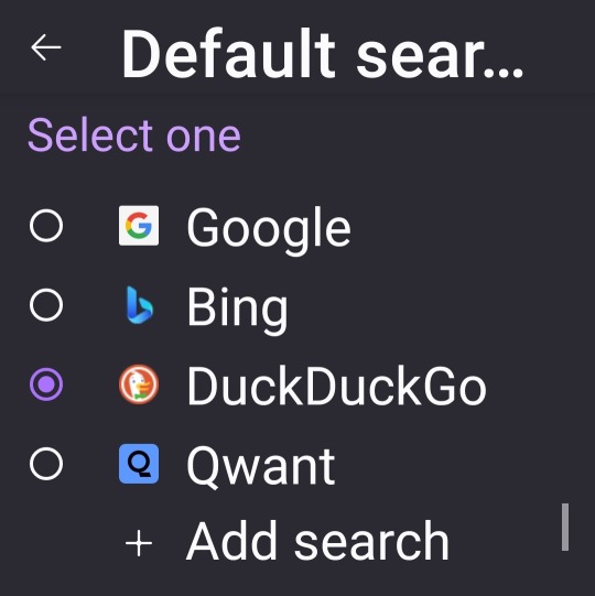
These are the standard search engines but you can add more if you want. You can use Yahoo or Wikipedia for example.
What Firefox allows you to do that chrome, on the mobile app, doesn't is to have add-ons, more commonly known as browser extensions. The normal Firefox app doesn't have many add-ons available but it has at least some and the ones that are available are very useful.
They're great for adding extra security protection, or just to have a better experience using the browser.
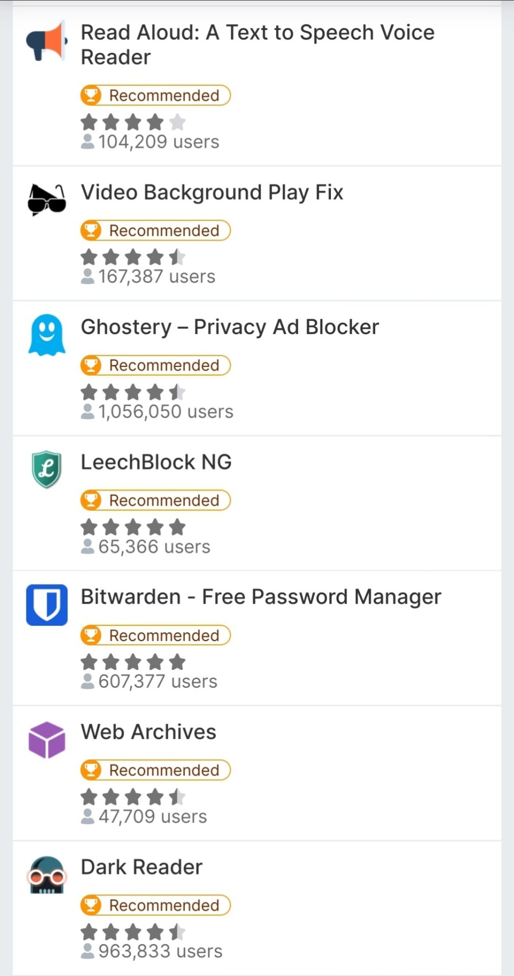
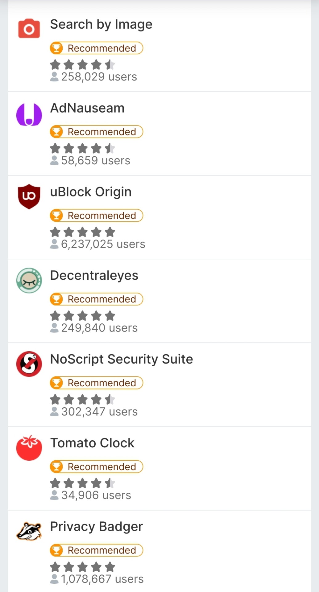
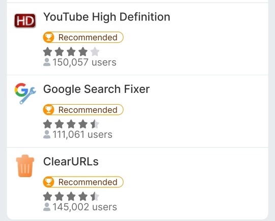
These are all 17 mobile compatible add-ons. Highly recommended UBlock Origin, Clear URLs and Privacy Badger.
You can technically have more but that will make it so you need to use the Firefox Nightly app instead of the standard Firefox. Firefox Nightly is a developer app and you need a lot of extra hoops if you wanna have extra Add-ons on your phone. To me it's worth it because it means I can have XKit Rewritten, Tumblr's saviour at this point, on my phone which almost makes me want to delete the Tumblr app. However you want to keep things simple so just Firefox will do just fine. No need to complicate things.
In conclusion:
Migrating is easy because you can migrate passwords from a browser to the other, you can still use your Google services on Firefox, add-ons are cool.
#Fun fact! Firefox has the option to have you use Esperanto as your language in your browser.#gle original#ask#browsers#Firefox
30 notes
·
View notes
Text
My ideal to reorganize my 15 year old blog would be tools that Tumblr is never going to provide, lmao.
An update to Mass Post Editor (I think new xkit had smth better than this? or xkit rewritten?, but I admittedly haven't put either extensions in Firefox :/), that reorganizes the grid as how archive looks nowadays because long image posts have always been a mess that ruins the grid, and the way they look as same size squares in archive helps me BETTER. Also, something about going to specific tagged posts. To specific type of posts (image, written, links, video, etc... LIKE THE ARCHIVE DOES)
Actual looking at my OWN tagged private posts. I THOUGHT I was doing something neat while marking down old "private" posts with "private" tags. But, they technically "do not exist" as tagged posts if I look at them on the mobile blog view thing... unless you search the terms contained in the post itself, btw. So, I need to do smth much more neat ideas (or much more specific) in regards to that, lmao.
Changing main blogs -> side blogs, viceversa or smth...? I know there's some logistics there that haven't been simply done (I think this has been on the average tumblr user wishlist for support/dev team for a LONG TIME) due to old noodley coding, maybe? to let you do so, especially with older URL blogs, and so. I had this weird idea of reblogging old posts for an archive blog thing and deleting them from main, but, honestly it's a task I don't want to do (especially due to the QUANTITY of stuff I have here for FIFTEEN YEARS). Like... I'm real with you, I wish I could move to a new blog because, as I always have been complaining in the past few years, my main blog is messy, has glitches that come from the old early 2010s Tumblr days, smth about "rebranding myself",etc. I know ppl sometimes do a side blog and it becomes their "main" so to speak, while their "old main" is an archive... and I'm attached to main, and I also control my other sideblogs from this account and, UGHHHH. I cannot do that. I don't want to start from zero and such. If I made that decision, 10 years ago, that would have been better moment, lmao. Now? I can't. I simply can't, I feel.
#kao's nonsenses#let me dream for a bit :')#it just amazes me (baffingly so?) that some of my most used tags are OVER 2k posts and I'm scratching my head on 'HOW'#i mean... for 5-6 years? I kinda get it... but MAN. *MAN*#there's a high chances some of my most used tags are also broken though :T?#i mean... yeah...? but also :T
2 notes
·
View notes
Text
actually, here, have a list of the add-ons i use that make my life so much better (they’re all for firefox but many have a version for chrome): - adblock/ublock origin, obviously - ublacklist, lets you block sites from google results - ao3rdr, lets you block tags (drivers you hate, for example) from ao3 search results, among other things - xkit rewritten, if you use tumblr without using xkit i’m honestly slowly backing away from you rn. lets you completely overhaul your dash/functionality, from restoring full timestamps on posts to color coding posts to hiding tumblr radar and tumblr live to hiding all instances of single posts and dozens of other things. - video downloadhelper and hls downloader, detect videos on every site you visit and enables you to download them even if the site is trying not to let you (some exceptions, geoblocked videos for example) including in hq/1080p - privacy badger, makes sure advertisers don’t track you, including ones who ignore your ‘do not track’ warning - search by image, right click any pic and it uses the classic (non-radar) google reverse image search, or several other sites you can choose from - sponsorblock for youtube, automatically skips/mutes intros/outros, ‘this video is sponsored by’, personal endorsements, etc (with an option to disable individual skips) - save webp as png or jpeg, self-explanatory and, most importantly, this one turns your youtube status bar into nyancat <3
5 notes
·
View notes
Text
Tumblr Clients to Use Other Than This Shitty App (but honestly thoooo...)
This is a long list and it's mostly me rambling about features that stood out to me. Also, going through these, no client here is going to completely replace the desktop or the app for most people. All of these clients have something up with them that, at least for me, hasn't made me stop using official tumblr options. Even the option I actually recommend to use is still just the official tumblr app while on desktop it's best to just use dashboard unfucker and xkit rewritten.
Think of these as companion apps for the most part.

Desktop
Washboard.ws: Browser || Free
Idk if anyone still remembers washboard?? I remember it being the first tumblr client I've seen people talk about back in the day... and, boy, does it still feel like it's back in the day.
It's a bit old feeling since it still using the older tumblr dash layout and I think some features don't work correctly like search not working and trying to reblog or like a post gives you an error. Their blog hasn't been updated in 2 years and the site feels like it hasn't been updated in 7 so while it's up and running, it's not very functional anymore. I just had to mention it because I appreciate it so much.
My Pros • Dashboard Views - List (Blockquote/Old Tumblr) • Viewable Posts - Text Only, Text w/ media, Photos, Videos, Audio • Posting - Redirects to Tumblr • Reblogging - Queue, Draft, Private, Schedule • Side Blogs - View, Reblog • Search Support - Clickable Tags Only • Messaging Support - Ask (redirects to tumblr) • Save Tags • Filter/Blacklist My Cons • Feels like 2009 bc of old dash design • Reblogging is broken • Liking is broken • No search bar


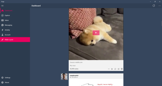
Ouga: Windows Desktop app || Free/OTP - $4.99
One of the desktop apps I've used for quite a while. It's ok, it feels better than Tumblast and 6tum (which isn't on here bc it doesn't work right and I've already made an exception for washbaord) to use but I've also had more crashes than Tumblast. Still, to me, it's the better working and easy to understand client on the windows store.
My Pros • Dashboard Views - List • Viewable Posts - Text Only, Text w/ media, Photos, Videos, Audio • Interruptions - Banner/Footer Ads • Posting - Queue, Draft, Private, Schedule • Reblogging - Queue, Draft, Private, Schedule • Side Blogs - View, Reblog, Post • Search Support - Bar, Clickable Tags • Messaging Support - Ask, IM • Download Support - Images, Videos • Filter/Blacklist • Activity Feed • Multi Account • Add Tags to Posts My Cons • Interruptions - Dashboard Tumblr Ads, Banner/Footer Ads • Crashes sometimes

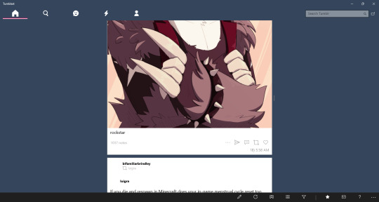
Tumblast: Windows Desktop app || Free
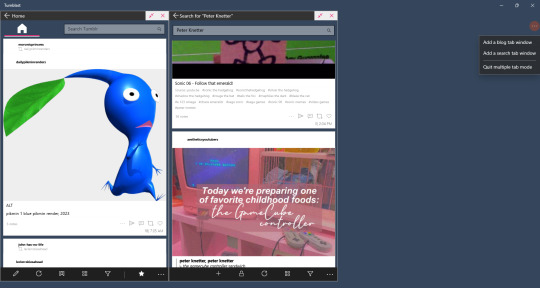
So/so about this one. It works enough to make a post, reblog things, like stuff, but I think it's a little bit more clunky than Ouga. I do like this one feature that let's you have multiple tabs open. It's not a well working feature that sometimes crashes the app and searching tags don't always show with this enabled, but you can do it.
My Pros • Dashboard Views - List, Blockquote • Viewable Posts - Text Only, Text w/ media, Photos, Videos, Audio • Posting - Queue, Draft, Private, Schedule • Reblogging - Queue, Draft, Private, Schedule • Side Blogs - View, Reblog, Post • Search Support - Bar, Clickable Tags • Messaging Support - Ask, IM • Download Support - Images, Videos • Filter/Blacklist • Activity Feed • Multi Tabs • Add Tags to Posts My Cons • Look/feels like it was made for windows 8 & 7 mobile.. it came out for windows 10 • Searching bugs out sometimes • Can feel clunky • Icons aren't showing right now

Tumblesocks (updated fork): Emacs app(?) || Free
.... i....... tried.
I know I put this off for most of the month bc I had a feeling it'll be a bitch in a half to do (and I was right) but I didn't know I'd spend 3 days trying to get this client to work. Emacs itself was difficult to work with even though I went the simple way and the gnu install.
I tried this out in Windows. Got frustrated. Actually fucked with Linux. Got more frustrated. I'm pretty sure Linux users are probably like "this is so easy" and that's fine but there's a reason I hate Linux and I'm not cut out to test out Emacs. I'm sorry.
If you're interested I still have the links above. Gargle's fork is probably the best to use since it's said to fix a lot of things. But I absolutely invite anybody to reblog this or send me an ask explaining how to get this shit running in the most hand holdy way.

As far I can find, there isn't a client app for macos. I closest I saw was an app called MenuTab Pro for Tumblr which everyone was saying doesn't work (anymore?). From the looks of it, it would've fallen under "viewer" for me so I most likely would've skipped it anyways.

Android
Tumblr (revanced): Android || Free
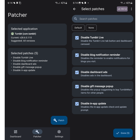
So this post was made awhile back before tumblr was supported by the revanced community. I'm excited to see that, while I was testing all these clients out, some people have made tumblr patches for revanced!
There are very little patches right now. Most importantly the tumblr live icon is now gone and ads are supposed to also be gone but that sims a bit more finicky. It only says that dashboard ads are disabled and sometimes it feels like they are but then they come back in full force so you'll have to force close the app in settings and then they're gone again for awhile. The same with blaze post as it feels like they've also been disabled until it doesn't.
Even though these are early patches, it's still the only option I would replace the original app with. It's not a client so you still have to deal with Official Tumblr App Bullshit™ but you also get all the expected or good features of the tumblr app that some of these clients don't have. I would like to see more patches like hiding the badges or fixing how the disable ads patch work but it's still better than nothing.
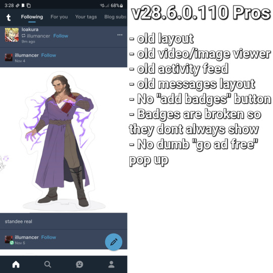
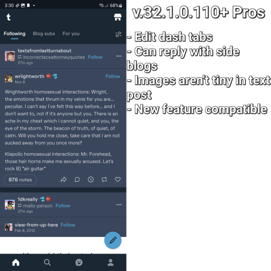
This bit is long, sorry, but I wanna add it's worth picking between 2 versions of the tumblr app depending on how you like the layout. v28.6.0.110 (the version I use) has the old layout and some problems that come will it like tiny images in text post, not being able to reply with side blogs, and sometimes some things just stop... working at times? While any version after that will have the new layout what comes with it: tumblrmart icon, changed activity feed, new video/photo view. I love the old layout over the new one so I stick with v28.
Both versions have their goods and bads and is why I have 3 versions of tumblr on my phone. Using app cloner (better options are behind an otp. don't get the sub, it's not worth it) you can install different versions and see what you want.
My Pros • It's still the Tumblr app so everything you like is all here • No ads! (sometimes) • Tumblr Live icon is gone <3 • Am able to test out newer features that are actually useful and interesting (like collections and interacting from side blogs) My Cons •Blaze posts are still present at times • It's still the Tumblr app so almost everything you hate is still here • Badges are still visible as well as version newer than v28.6.0.110 will have the "add badges" button on your blog • Annoying pop ups like going ad free or whatever are still a thing if you're using any version with the new layout • Breaks like "but wait! there is more" and "check out these x" are still here • TumblrMart icon is still at the top corner on the new layout

TeeHub: Android/iOS || Free/Sub - $1.99, $3.99, $5.99/OTP - $8.99
TeeHub is no longer on either app store. You can download the latest apk and modded apk here
While this has become my new favorite android tumblr client, the free version of this app feels so limiting and the paid version don't feel that better. I'm still happy that they added the one time payment option because I'm tried of subscriptions but stuff like not being able to see text only post at all, problems with posting, and no filter feature is so annoying to me.
Currently, TeeHub, on the tumblr side of things, feels lacking but also on the same level as Tumbletail for Android. There is an OTP of $8.99 and 3 sub options of $1.99, $3.99, and $5.99. If you like this and want to support it getting better I'd say just do the OTP because while the pro features aren't anything important, paying 9 bucks once feels more worth it than paying around 50 by the time the month is over.
TeeHub is only my favorite android client right now because it looks nice. If Tumbletail fucking updated their app so you can post in the paid version and it didn't look like shit it'd be a different story.
My Pros • Dashboard Views - List, Grid • Viewable Posts - Text w/ media, Photos, Videos • Posting - Queue, Draft, Private, Schedule • Reblogging - Instant • Side Blogs - View • Download support - Images, Videos (paid) • Multi Account (paid) My Cons • Interruptions - Popup Ads(? they said there's ads but i couldn't get them to popup even on a separate phone soooo) • Subscription • Can't view text post • Can't post/reblog to side blogs • Can't post/reblog to queue, draft, schedule, or privately • Can't add tags to post • No search function • No filter/blacklist support • Posting videos/photos aren't working right now
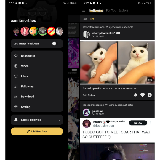

Tmdroid: Android || Free
This one I love what they're trying to do I just think it needs more time in the oven. Some of my problems with this that aren't in my cons list are some of the dashboard settings in carousel view aren't available in waterfall view (the view I use in the image) and text post specifically don't have a square around them to separate them from other post. It's not that bad when it's a text post sandwiched between images but when there's text posts in a row, like in the image, it all looks like 1 text post.
They do have a blog and this app does get updates so I've been keeping an eye on this. They seem to be very open and accepting to feedback unlike someone else on this list and that's really fucking cool.
My Pros • Dashboard Views - List (Waterfall), Grid (Columns), Carousel • Viewable Posts - Text Only, Text w/ media, Photos, Videos • Reblogging - Queue • Side Blogs - Reblog • Download support - Images My Cons • Weird UI • Unresponsive UI • Limited or clunky side blog support • Can't make posts • Can't reblog to draft, schedule, privately • No search function • No filter/blacklist support
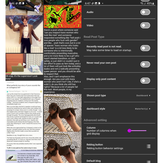

Tumbletail (Lite): Android/iOS || Free/OTP - $1.99
*screaming and crying* I feel like... a disappointed parent. Except I'm not disappointed. I'm mad.
This was my favorite client all the way back in 2012 when I was forced to use an iphone 3gs. I loved the way it looked, the text post were easy to read, it was smooth to use, it had a tag history that made reblogging & making post easy for me who ran an acnl blog, had really good settings to mess around with.... Y'all... so much of this is just not on the android version.
And it fucking pisses me off lol. There's no reason for the android version to look so ugly, to be lacking in settings & features, to not give paid uses the ability to post when you can on ios?
While the android version of this app is usable, moving from the ios app to android and seeing how lacking it was comparably and seeing people give feedback to cathand (who did have a blog) but they went unanswered while the ios version still got updates... The ios versions aren't perfect but it's a much better experience than the android apps. And I'm a bit mad about that.
My Pros • Dashboard Views - Grid, List (change thumbnail size to huge) • Viewable Posts - Text Only, Text w/ media, Photos, Videos • Reblogging - Queue, Draft • Side Blogs - View, Reblog, Post • Search Support - Bar, Clickable Tags • Download Support - Images, Videos (via video player options) • Multi Account (paid) • Tag History • Add Tags to Posts My Cons • Interruptions - Banner/Footer Ads • Can only make post in the ios app??!?!?!?!??? • Polls are viable as text posts but are broken • Looks cleaner on ios • Non photo/video post could be better formatted • Text posts contents are too large and you can't zoom out to see everything • Photos/Videos made using the new text editor (Text w/ media) are seen as text posts • ios version have more features/settings • Only posts uploaded as photo/video (not text w/ media) will have clickable tags • No filter/blacklist support
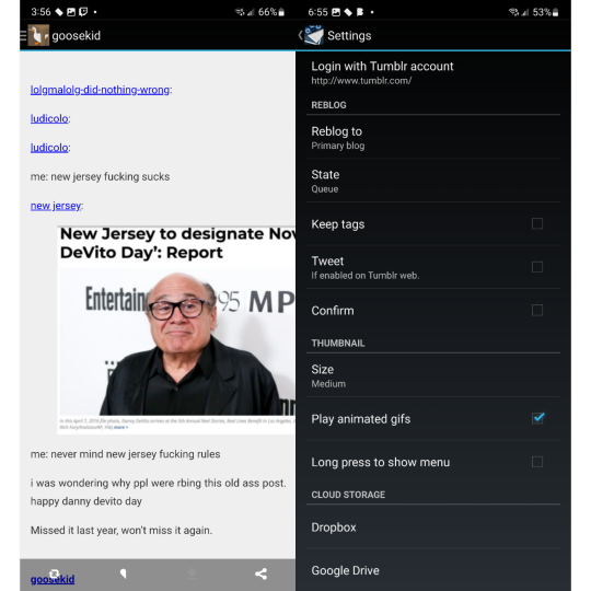
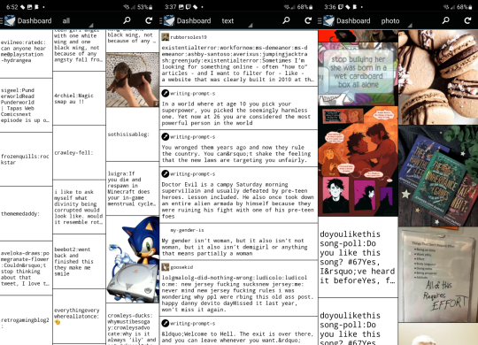

Violet: Android/iOS || OTP - $0.99
Violet is a weird on. I want to see it get better but I also don't recommended it. It did get a price cut to $1 so, ya know, but I think as a client it's not good. As a viewer, it's usable. I don't like the carousel view I'd rather have a normal dash. Stuff like posting and searching aren't a thing and reblogging isn't as featureful as I wish.
This works best in the way we heart it and instgram do, not like tumblr does.
My Pros • Dashboard Views - Carousel • Viewable Posts - Text Only, Text w/ media, Photos, Videos, Polls • Reblogging - Instant • Side Blogs - Reblog • Download support - Images My Cons • Account login troubles • Polls redirects you to tumblr • Can't make post • Can't reblog to queue, draft, schedule, or privately • No search function (tags open tumblr) • No filter/blacklist feature
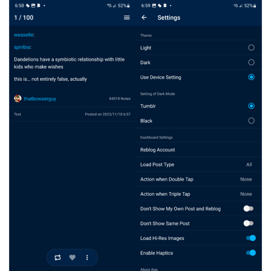

iOS (mostly the iphone bc i dont have a tablet)
Tumbletail (Lite): Android/iOS || Free/OTP - $1.99
yes we're back again bc ive been yelling about this for years but i"ll make it quick
Had this app since 2012 and I still recommended using it along side the tumblr app. Mostly because of how tumblr works today with their restrictions and inclusion of a filters list.
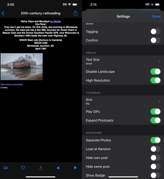
While text post in the dash view looks better than on android to me, open a text post the contents are so small but they fit the screen. I know the image shows that I have text size small but that's only because it doesn't change anything that I can tell so I left it alone.
My Pros • Dashboard Views - Grid, List (change thumbnail size to huge) • Viewable Posts - Text Only, Text w/ media, Photos, Videos, Audio • Posting - Queue, Draft • Reblogging - Queue, Draft • Side Blogs - View, Reblog, Post • Search Support - Bar, Clickable Tags • Download Support - Images • Multi Account (paid) • Tag History • Save Tags • Add Tags to Posts My Cons • Interruptions - Banner/Footer Ads • Polls soft crashes back to dash • Hard crashes a lot more than on android • Dash view only shows media and text post separately • Quote, Link, Chat, & Audio are sorted as Text Post since you can't view different types of posts like on android • Photos/Videos made using the new text editor (Text w/ media) are seen as text posts • Only posts uploaded as photo/video (not Text w/ media) will have clickable tags • Can't post videos • Can't download images and videos from Text w/ media post • Searching by clickable tags is broken • No filter/blacklist support
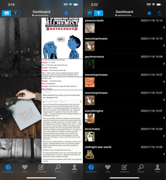

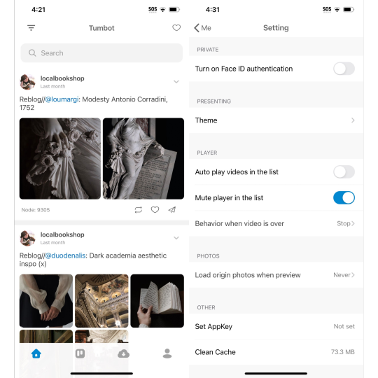
Tumbot: iOS || Free/OTP - $4.99
This is the most fine and normal client on ios so far and I honestly really love it for that. I found the only big problems I had was I couldn't post anything, you can't add tags when reblogging content, and that you couldn't reblog to queue. As a primarily queue user, that's annoying.
I think the best way to describe this app is "chill". If I was able to make post and use queue/draft this would be my replacement app.
My Pros • Dashboard Views - List • Viewable Posts - Text Only, Text w/ media, Photos, Videos, Polls • Reblogging - Instant • Search Support - Bar, Clickable Tags • Multi account support (paid) • Download support (paid) My Cons • Interruptions - Banner/Footer Ads • Dark mode paywalled • No side blog support • Can't make post • Can't reblog to queue, draft, schedule, or privately • Can't add tags to reblogs • Crashes sometimes • No filter/blacklist support

MultiTab T: iOS || Free/Sub - $2.49, $5.99
MultiTab have old pricing structure list that is still up on the apple store page but is not longer effective since the subscription model was added, sadly.
Another app I would actually buy if they didn't only have fucking subscription options.
Compared to Tumbot it kinda feels less clean to me. Idky but it looks a bit clutter or busy even if you only have one dashboard tabs open. I also think post not having a boarder or a different background from the background isn't helping either.
But the way this app handles reblogging is so good and the custom dashboards that I've been wanting on this damn site for years is here but pretty limited. I'm sad that even paid users have a pretty small limit for how many people you can add to a "feedset".
My Pros • Dashboard Views - Grid, List • Viewable Posts - Text Only, Text w/ media, Photos, Videos, Audio, Polls • Posting - Queue, Draft, Private, Schedule • Reblogging - Queue, Draft, Private, Schedule • Side Blogs - View, Reblog, Post • Search Support - Bar, Clickable Tags • Download Support - Images, Videos (paid) • The most features/settings I've seen so far • Best reblogging menu I've seen so far • Multi Account (paid) • Multi Tabs (Customizable - 5 - free | 20 - paid) • Tag History • Save Tags My Cons • Interruptions - Banner/Footer Ads, Popup Ads • Subscription • Polls are viable but can't vote • Doesn't show or explains everything a premium subs gives you • Holds to reblog doesn't show all side blogs • Dashboard Feeds are limited even if subbed • Adding blogs to custom feeds don't always work correctly • No filter/blacklist support
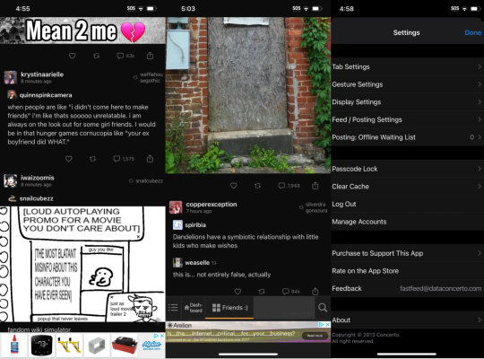
#tumblr#tumblr app#tumblr update#tumblr client#tumblr alternative#<- but not really bc it's still tumblr but ya know what i mean#washboard.ws#ouga#tumblast#tumblesocks#revanced#teehub#tmdroid#tumbletail#violet#tumbot#multitab t#fastfeed
25 notes
·
View notes
Text
Truly, this is happens to everything I post. Which is why I did this because I didn't want to explain this to the ether. But we're over 10 notes now, so I'll spill.
If you're the type of person that likes to catch up to where you left on Tumblr, you can both save your place and resume from another device if you do the following:
Turn off endless scrolling.
Turn on tab syncing on your browser (and also use the same browser to browse Tumblr on your other devices. I use Firefox on desktop and mobile).
This works because, when endless scrolling is disabled and you click next to continue to the next page of your dash, Tumblr stores the max post id in the URL which means you can always recreate where you are on your dash with that URL (example: https://www.tumblr.com/dashboard?max_post_id=733809377685946368). So you can always pull up your spot from your browser history or from any synced device.
Besides, that, I actually highly recommend disabling endless scrolling for mental health reasons. I've honestly had a healthier relationship with Tumblr since turning this off. It's so much easier to say, let me just finish this page and be done and actually stick with it than just trying to stop after one more post. Especially when you scroll and you can see the beginning of the next post which naturally piques your curiosity.
There are downsides, and that's if you want to do the whole multi-device thing, I'm not going to lie to you and say that the mobile web version of Tumblr is great. It's not. However, it works a lot better with endless scrolling disabled, since it only has to hold so many posts in memory at once. Before, once I scrolled far enough down my dash it would often become extremely buggy or just break.
On the upside, using Tumblr from something like Firefox mobile means you can use ad-blockers on it. uBlock Origin is available in Firefox mobile, plus there are other privacy protecting features and extensions (I wish you could use Xkit Rewritten on it, though). Or you can use any other mobile browser that has features you like. Honestly, this is the reason I stopped using the Tumblr app. Even though I was paying for ad-free, it was still riddled with trackers. So I canceled, uninstalled, and haven't looked back. I've been using the web version on mobile for about a year now...
Truly, the worst problem with Tumblr on mobile web is posting... it's awful. It's the same editor that's on the desktop web version and it's not at all optimized for touch screens. There have been many posts and comments that I've just abandoned because it just wasn't worth the hassle (also, as stated above, no one cares any way).
Although, while researching the settings for this post, I literally just noticed that you can change the editor from their rich text editor to "plain text/HTML" or Markdown, so I'm going to give Markdown a shot and see how that goes.
I ended up turning this stuff on for their own reasons, and it wasn't until I wrote the first post that I put all of this together. I've been doing this now for a couple of months since I discovered it and it's been nice going through my dash on my laptop then picking up where I left off when I need to use the bathroom or when I'm on the go.
I still don't ever catch up though. I follow too many people and disabling endless scrolling encourages me to not spend eternity on this site. But I no longer live in terror of losing my place and can easily find it again by going through my browser history.
tl;dr turning off endless scrolling in Tumblr allows your browser to remember it's place on the dash and you can resume from your history or by syncing your tabs to another device.
Y'all!!!!!!!
I just discovered a combination of settings that enable an incidental, killer feature in Tumblr. This shit is a game changer! Buuuuuut I'll only tell if I get 10 notes on this post.
14 notes
·
View notes
Text
EDIT 1/14/2022: I realized this PSA isn’t as descriptive or helpful as I would have liked so I put together a very short guide for a few of the xkit modules here! It covers installation, a few modules that are useful as a roleplayer to configure, & more detail on how editable reblogs actually work.
okay so here’s a psa because xkit rewritten is way less buggier than “new xkit” and i’m trying to transition to using it.
MUTUALS, LISTEN UP, XKIT REWRITTEN IS BOUTTA ROCK YOUR WORLD.
so you know how xkit editable reblogs get rid of avatars when you use the editable reblogs? yeah, guess what -- xkit rewritten's 'trim posts' does not do that. it preserves them, and preserves the new reblog format instead of using blockquotes/indents to determine it. there is no backspacing the old stuff out. it just cuts it down to what you need with the click of a button. ONE BUTTON, GUYS. ONE. BUTTON.
Now -- here's the biggest downside. YOU NEED TO USE THE NEW BETA EDITOR IN THE BROWSER. You reblog, you save to drafts, and bang. It's there! Now, I know you're all wary about this, because if you edit and work on a draft, old xkit does dumb shit and posts your drafts and *angry @ tumblr noises*. XKIT REWRITTEN DOES NOT DO THAT. It will preserve the formatting and not obnoxiously post your post if you go in and out of the draft.
The only downside is, if you're writing with someone using the old xkit, then it basically just copies your old post into their post, and you can't actually 'cut' anything, because your old reblog no longer exists, so guys -- transitioning to this is going to be key. Wanna know why? The legacy editor won't be staying. "beta" means it's probably going to be coming out soon, and you need to take the moment and transition NOW in order for it to work.
BUT WAIT -- IT'S GIVING ME A LEGACY POST CANNOT BE CUT ERROR!
Take a sec and take another deep breath. I've sent a bug request in to the xKit Rewritten creator, so hopefully, that will get looked at, HOWEVER, in my sleuthing, I have discovered a workaround. Open your original post -- the first post of that thread, the original reblog, etc--in the NEW EDITOR. If you can't switch to the new editor, OPEN IT ON A MOBILE DEVICE. make the tiniest change -- change a format or italics or something, and save the post. YOU WILL NOW BE ABLE TO USE THE NEW TRIMMED REBLOGS FEATURE.
The above also cleans up the notes so old posts aren't repeating. I'm probably going to be transitioning myself to not using the old xkit, so if yall can't transition with me, you can deal with my uncut posts. I'm v much about moving ahead before things are obsolete, and frankly the old reblogs look horrible IMO.
IF YOU NEED HELP SETTING UP XKIT REWRITTEN, FINDING IT, SEEING HOW IT WORKS, REACH OUT TO ME. I'M CURRENTLY RUNNING BOTH, BUT REWRITTEN IS OH SO MUCH BETTER.
they're working on transitioning a lot of the other features over, but this one is designed to work with the new tumblr formatting and the new tumblr code, so i heavily recommend transitioning to it before the old xkit becomes obsolete and you're scrambling.
#xkit rewritten psa#xkit rewritten is honestly so much better#i highly recommend transitioning NOW before tumblr nukes the legacy editor and you're left scrambling#xkit likes to crash and not show up sometimes i notice on certain pages#and seriously aprilsylph has done so much fking work to transition xkit to the new tumblr coding#eventually the old xkit will become obsolete because that's how these things work
39 notes
·
View notes
Text

(hell yeah. heres a whole post blogging about my blog. i hope you like introspective words. if not... then definitely dont click that readmore)
I posted 3,572 times in 2022
That's 3,572 more posts than 2021!
(well... a respectable amount... for this being the first year of Blog Existing)
370 posts created (10%)
3,202 posts reblogged (90%)
Blogs I reblogged the most:
pepsitwist
dogcollarpunk
hoodyhoo
allelitewrestlings
(3 people with the best tastes on the site and a fantastic sourced aew content blog. hell yea ofc these were my most reblogged blogs)
I tagged 3,533 of my posts in 2022
Only 1% of my posts had no tags
(oh no. where are they. where are these 40 untagged posts?? how could i leave them BARREN... NO... THEYRE LOST... OUT IN THE COLD...)
#chuck taylor - 576 posts
#orange cassidy - 570 posts
#cm punk - 500 posts
#fanart - 406 posts
#p - 291 posts
#trent beretta - 229 posts
#talkzon - 221 posts
#mjf - 220 posts
#jon moxley - 201 posts
#eddie kingston - 198 posts
(ah yes my top 3 favorite wrestlers. chuck, orange, cm punk. of course. LMAO. funnily enough the pipeline for me was in that exact reverse order... punk vs eddie got me watching the show, then i saw an orange match and was like hey thats fun and cool, then i was like hold up... whos that weird-cute guy who hangs out with him sometimes... and now here i am. with incurable chuck taylor brain worms.)
(ok. actually the story is a bit more ironic than that but if i get too openly genuine on here i'll break out in hives sooooo moving on)
Longest Tag: 140 characters
#excalibur said something last friday along the lines of ''hes not willing to team up with danhausen yet'' which made me laugh out loud. ''ye
(my tag got cut off... i think this is before xkit rewritten added the ''tag too long'' alert for the quicktags thing. i dont even remember what the rest of it was supposed to be... this was on a gifset of the hook birthday chips incident)
My Top Posts in 2022:
#5


thank you aew broadcast team for the instant replay alternate angle on wardlow's very cool pin
295 notes - Posted July 13, 2022
(...i liked wardlow better when he was a vaguely amoral henchman guy but i can appreciate A Very Cool Pin)
#4
"One word to describe me? GAY"
295 notes - Posted October 17, 2022
(the people need to know. they need to know max caster is an entertaining and somewhat unhinged weirdo)
#3
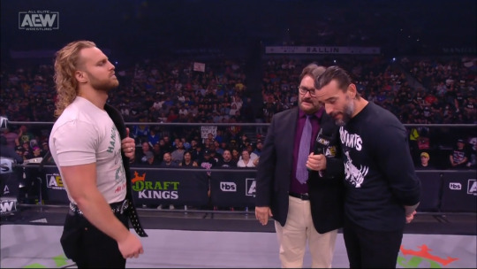
listen. look. i need you to understand. look at this.
SLOUCHED. HANDS BEHIND HIS BACK. HEAD BENT DOWN. cm punk spends most of his promo at this point AVOIDING EYE CONTACT. he never even holds the goddamn mic!!! punk is posturing SO hard to appear as a small harmless creature. so much smaller than hangman.
which he factually ISNT. i mean, look at how he looks when he stands up straight, when he isn't trying to put on an appearance.
See the full post
325 notes - Posted May 26, 2022
(oh noooo lmaoooo not my overly excited cm punk theory-effortpost... embarrassing...... even more embarrassing in hindsight... u_u "wow theyre doing such a good job of working together to tell this fictional story of conflict and antagonism! such acting! such subtlety! wait. what. no. are you guys mad for real. what the")
#2
See the full post
389 notes - Posted June 4, 2022
My #1 post of 2022

how im feeling about that upcoming dog collar match
752 notes - Posted March 5, 2022
(honestly the most shocking part of this was seeing people out in the wild think this was where the sickos meme came from? which doesnt even make sense chronologically?? sickos has been around forever!!! and the original comic is so good. i am not deserving of kartoonist kelly's onion comic clout i am just a wrestle blog)
(also. i have to say. getting into wrestling right as the cmjf feud started was such a mistake... it set the bar too high... wrestling is not normally Like That... ;~;)
Get your Tumblr 2022 Year in Review →
#year in review#talkzon#why do they add like 4 different tags for ''year in review''. no. i will have a single one
7 notes
·
View notes
Text
I have a hard time processing like... the history and structure of the other webdev project I work on (which in some ways you could call "my project," but realistically it most definitely isn't just that, which is maybe the point.) Because it's... eh, I'll skip all the details, but basically it was a collaborative project done without much communication in which two people wrote completely intermingled systems (loosely, front end and back end) with somewhat conflicting styles.
Like... I don't think I've really put it to myself this way before, but I think it's fair to say that I can't really modify any of my collaborator's code. Like, I can, but... no, honestly, realistically, I can't. It's not immediately obvious to me what the correct way to write things within the structure of his code would be, so while I can do work that has the practical result of "modifying the code," what I am mentally doing is "learning the code, re-imagining it in some sense, and rewriting it in some sense such that the changes I want are implemented but most of the rest of it is the same."
(I was going to write about various architectural things here, like how we have chosen to add frameworks like internationalization that have frozen structures into the code that I need to change but can't without breaking the features they add, but that's beside the point honestly.)
And I am really curious if it is like this in industry. I mean, obviously the answer is going to be "yes and no, in various measures, and it depends on what codebase you encounter at the time." But still, like... what realistic levels of expectation can you have that the code you inherit is polished down to the minimum representation of what in the hell it is supposed to do? That it is compartmentalized into pieces you can change? That takes work. That also takes forethought, which is work. No one can do an infinite amount of work on things which don't directly affect the end user experience (though if you've read my XKit Rewritten PR history, you will know that I have gotten quite close to that platonic not-an-ideal. It almost looks like a case study.)
And of course that brings up my only data point to compare to, which is XKit Rewritten. Perhaps the ultimate in code purity. An example of what happens if you solo develop until the structure you have created will, in most regards, demonstrate fairly obviously how you ought to go about adding something to it or will just disallow that thing entirely.
I wouldn't have made XKit Rewritten in the exact same way April did (well... let's pretend I hypothetically have the skills to do that, for the sake of this sentence). Fairly close, though, probably. But that really doesn't matter. The point is, I can reasonably intuit from the code how "the XKit Rewritten way" to do XYZ would be, and so I don't really have to spend time trying to parse that when I experiment with adding or modifying things. And when I do, of course there's a collaborative process of code review that we do in order to ensure that a future reader of the modified code (which could be me) continues to see a cohesive structure and style and thus continues to skip that processing step. And that takes work, obviously, but I think it's valuable to note that it wouldn't be nearly as possible without the work that came before it to define the expectations the core review is in service of meeting. I don't spend any time looking at code review suggestions thinking "what is the goal of this," I spend them thinking "ah, right, of course; now can I think of an even better way to represent that?"
And naturally I would imagine that enterprise code is not like that, at all. But I have no idea how much. And I'm curious what the... I guess you might call it institutional knowledge? is like.
1 note
·
View note
Text
So as a heads up for mutuals: I'm going to be switching permanently to xKit Rewritten over the old xKit which uses the legacy editor on Tumblr still.
The fact of the matter is, when I'm trying to work from mobile, xkit rewritten is just a lot less hassle, ESPECIALLY if I am remoting in on my phone to try and edit/cut posts. So for moots that are still using the old xkit--sorry, but cutting replies is gonna be on you. The old xKit is just too buggy with drafts and too much hassle, and if you're cutting using old xkit, it won't let me cut using the new one.
if you want help switching to the newer xkit (it's better compatible/more stable, and it preserves icons on reblogs unlike old xkit), lemme know and I'd be glad to help! honestly, it's a one-button thing to cut, and since it works right from drafts, there's no issues with having to wait til you're ready to post before cutting the post.
If you don't want to switch, that's on you, but I'm going to be leaving cutting posts up to you. The hassle's just too much to try and select/backspace, esp when I'm working from mobile to try and cut posts.
7 notes
·
View notes